How to Prepare Embroidery Artwork for Clean Results
- October 16, 2026
- 2:52 am
Embroidery turns a logo into a durable, tactile mark people notice up close. But the finished result begins well before a needle reaches the garment. Knowing how to prepare embroidery artwork helps your team avoid muddy details, unexpected simplification, delayed approvals, and logos that look different from one apparel item to the next.
For business uniforms, event apparel, caps, outerwear, and promotional gear, the goal is not simply to submit a logo file. The goal is to supply clear artwork and enough production direction for the design to be digitized correctly, sized appropriately, and placed where it supports a polished brand presentation.
Start With the Best Available Logo File
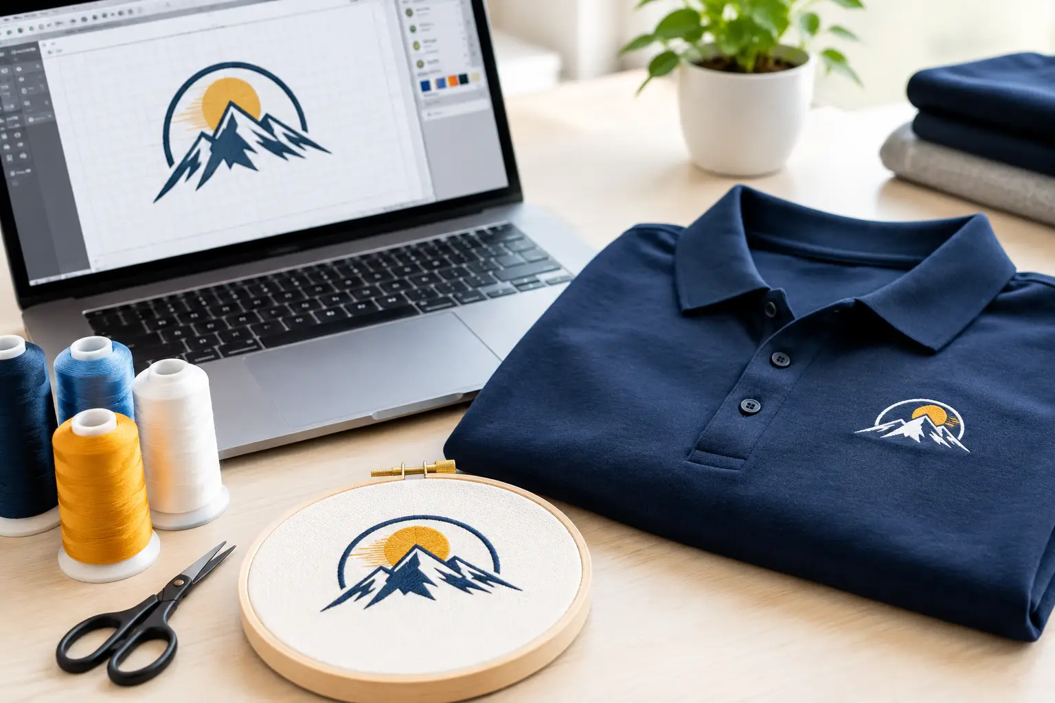
A vector file is the preferred starting point for embroidery artwork. Formats such as AI, EPS, PDF, and SVG preserve the logo as editable shapes rather than fixed pixels. That allows the embroidery team to inspect line weights, lettering, color areas, and fine details before creating the stitch file.
A high-resolution PNG, JPEG, or TIFF can still be useful, especially if it is the only version available. Send the largest, cleanest copy you have. A small image copied from a website, screenshot, email signature, or social media profile may look acceptable on screen but can hide details that are hard to interpret accurately in stitches.
Do not confuse a production embroidery file with source artwork. Files such as DST, EMB, EXP, or PES contain stitch instructions for specific embroidery machines. They may help with a repeat order, but they are not always editable, scalable, or compatible with every production setup. Your original vector logo remains the best long-term brand asset to keep on file.
Know What Embroidery Can and Cannot Reproduce
Embroidery is built with thread, not ink. That difference matters. A printed logo can hold very thin lines, tiny type, subtle gradients, and fine photographic detail. An embroidered logo needs enough visual space for thread to form clean, readable shapes.
During digitizing, artwork is translated into stitch types, directions, densities, underlay, pull compensation, and sequencing. Those choices help the logo sit smoothly on the garment and maintain its intended shape. They also mean that extremely fine features may need adjustment.
Small text is one of the most common concerns. As a general production guideline, lettering below about 0.25 inch tall may not stitch clearly, depending on the font, fabric, and design. Thin script fonts, narrow serif typefaces, and letters with tight internal openings can be especially challenging. A simple sans serif font often performs better at a small chest-logo size.
Likewise, very thin outlines may disappear, and tiny gaps between shapes can fill in with thread. If your logo includes an intricate icon, consider whether a simplified embroidery version is appropriate for small placements. This is not a compromise in quality. It is a practical way to protect logo recognition on apparel people will wear and wash repeatedly.
Prepare Artwork With Size and Placement in Mind
The same logo may require different embroidery treatment on a polo, cap, jacket, bag, or safety vest. Before submitting artwork, identify the products you plan to decorate and the intended placement. A left-chest logo on a polo is often much smaller than a back logo on outerwear or a front design on a tote bag.
For many corporate apparel programs, left-chest embroidery lands around 3 to 4 inches wide, although the ideal size depends on the logo’s proportions and garment size range. A wide horizontal logo may need a different approach than a stacked mark. On a cap, available embroidery space is narrower and curved, so artwork that works on a jacket may need simplification for a clean cap front.
Placement also affects visibility and durability. Dense embroidery can feel heavier on lightweight performance fabric. A small, well-designed logo is often the stronger choice for moisture-wicking polos and thin quarter-zips. Heavier workwear, fleece, canvas bags, and outerwear can support larger or more detailed embroidery, but the design still needs to suit the garment’s construction.
If your brand uses a horizontal logo with a long tagline, ask whether the primary logo should be used alone on smaller placements. The tagline can remain part of the full brand system for larger applications, while the core mark stays readable on employee apparel.
Provide Correct Brand Colors
Include your approved brand color references whenever possible. Pantone numbers, CMYK builds, RGB values, or a labeled brand guide all give the production team a clear point of reference. Thread is selected from physical thread colors, so an exact digital match is not always possible, but accurate color information produces the closest practical result.
Specify which colors are essential and which may be flexible. For example, a dark navy logo may need a white or light-gray thread version for a navy jacket. A one-color logo can be an effective choice for caps, uniforms, and large programs because it is clear, consistent, and easier to reproduce across multiple garment colors.
Avoid relying only on a monitor image for color approval. Screens vary, and thread has texture and sheen that changes how color appears under different lighting. A digital proof provides a useful preview of layout, size, and thread choices before production begins.
Clean Up the File Before You Send It
Artwork preparation does not require you to be a designer, but a few simple checks can save time. Make sure you are sending the final approved logo, not an outdated draft or a version with temporary notes. Remove background images, drop shadows, gradients, and effects if they are not part of the essential mark.
If your logo includes multiple versions, label them clearly. For instance, distinguish the full-color primary logo from a one-color version, a reversed version for dark garments, and an icon-only mark. Clear file names reduce the chance of production questions and make future reorders easier to manage.
Before placing an order, gather these details with the artwork:
- The original vector file, plus a high-resolution image if available
- Approved brand colors or a brand standards document
- The garments, colors, quantities, and sizes you plan to order
- Desired logo placement and approximate finished size
- Any required text, department names, employee names, or locations
- A note about whether the artwork is new or a repeat of a previous order
This information gives the production team the context needed to recommend the right embroidery approach rather than treating every logo as a one-size-fits-all design.
Review the Digital Proof Carefully
The proofing stage is where business buyers can catch issues before production. Review the spelling, logo version, thread colors, placement, and overall scale. Confirm that the design is centered where expected and that any secondary details, such as an anniversary date or division name, are correct.
Pay close attention to the relationship between the logo and garment color. A design can be technically accurate but lack contrast on a similarly colored polo or jacket. Your embroidery partner may recommend a thread adjustment, border, or alternate logo version to improve visibility.
Also review the proof as a wearer would. A logo that is too large can overpower a professional polo. One that is too small can look lost on a roomy outerwear piece. The right proportion depends on the garment, the role of the apparel, and how formal the finished look needs to be.
Once artwork is approved, changes can affect production timing. Taking a few extra minutes at proof approval protects both your deadline and your finished product.
When a Simplified Version Is the Better Choice
Businesses sometimes worry that simplifying artwork will weaken their brand. In practice, a thoughtful embroidery adaptation often makes the brand stronger because it remains legible from a normal viewing distance.
A good embroidery version preserves the elements people recognize first: the logo silhouette, primary type, key icon, and core color relationship. Fine illustration, small legal copy, gradients, and decorative texture may be better reserved for print or digital use. This is particularly true for uniforms that will be ordered repeatedly in different sizes and garment styles.
For larger logos on jackets, bags, or fleece, more detail may be feasible. For a cap front or left chest, clarity usually wins. The best choice depends on the artwork, the placement, and the garment fabric.
Work With an Embroidery Team Early
If you are outfitting a growing team, launching a new uniform program, or ordering apparel for an event, share your logo before the final product decision whenever possible. That allows the embroidery team to recommend garments that complement the artwork and identify potential limitations upfront.
LOGO USA provides in-house digitizing, digital proofing, and USA-based decoration to help businesses move from logo file to finished apparel with greater confidence. An experienced production team can advise on thread colors, sizing, placement, and the right version of your mark for each product.
Your logo represents your company every time an employee meets a customer, attends a jobsite, or walks into an event. Start with clear artwork, make room for the realities of thread, and approve the proof with purpose. That preparation gives your branded apparel the clean, consistent finish your business deserves.
Popular Blogs
Screen Print Versus DTG for Your Next Apparel Order
October 14, 2026