Workwear Logo Placement Guide for Your Team
- October 26, 2026
- 2:52 am
A logo can look sharp on a digital proof and still miss the mark once it is worn on a jobsite, in a warehouse, or behind a service counter. This workwear logo placement guide helps you choose decoration locations that keep your brand visible, professional, and practical for the people wearing it every day.
The right placement depends on the garment, the work environment, the size and shape of your artwork, and the message you need the apparel to send. A field technician, restaurant manager, construction crew, and corporate event team may all wear branded workwear, but their logo needs are rarely identical. Thoughtful placement turns a basic uniform into a consistent brand asset.
Why Logo Placement Matters on Workwear
Branded workwear has two jobs: it identifies your team and holds up to real working conditions. A logo should be easy to recognize without interfering with pockets, zippers, safety features, tools, or comfort. Placement also affects how polished the finished piece feels. A small embroidered logo positioned cleanly on a polo can communicate the same professionalism as a much larger print, often with a more refined result.
Consistency matters just as much when you are ordering for multiple departments or locations. Establishing a standard left-chest logo, for example, makes reorders simpler and helps every employee present the same brand image. For larger programs, that consistency can save approval time and prevent a mix of competing logo treatments across the organization.
Decoration method is part of the decision. Embroidery creates a durable, dimensional finish that works especially well for polos, button-downs, jackets, hats, and many workwear layers. Screen printing is often a better fit for larger artwork, bold back graphics, high-quantity T-shirts, and designs with broad areas of color. The placement should support the decoration method, not fight against it.
Workwear Logo Placement Guide: The Core Locations
Left Chest: The Professional Standard
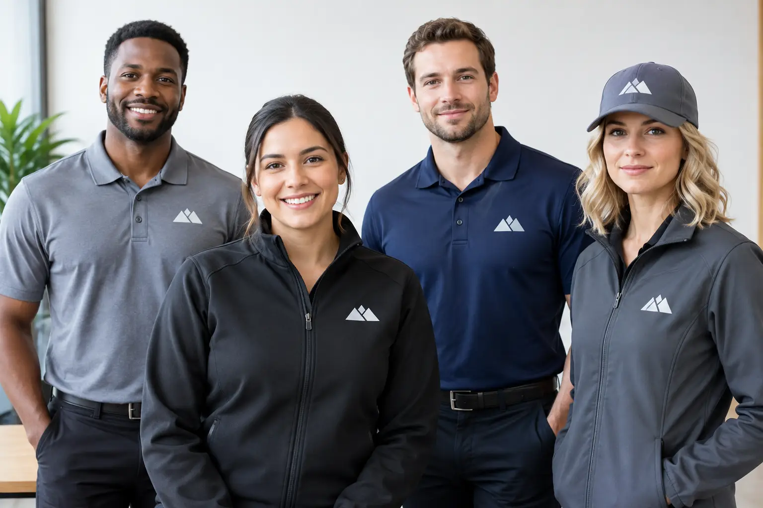
The left chest is the most requested location for corporate uniforms, and for good reason. It is visible during conversations, photographs well, and gives polos, button-down shirts, quarter-zips, vests, and jackets a clean, established appearance. For most businesses, this is the safest starting point for a company logo.
Left-chest decoration is particularly effective when the artwork is compact. A horizontal logo, icon with company name, or simple embroidered mark usually fits naturally in this area. Large, detailed artwork may need to be simplified or resized to retain clear stitching and legibility. A quality digitizing setup can make a major difference when converting artwork for embroidery.
Keep practical garment details in view. Pocket seams, zipper lines, reflective tape, and chest darts can affect placement. On outerwear, the logo may need to shift slightly to avoid a zipper or interior construction that makes embroidery difficult. A digital proof should confirm the intended position before production begins.
Right Chest: Best for Names and Supporting Details
The right chest is a strong companion location when the left chest carries the main company logo. It is commonly used for an employee name, job title, certification, department name, or smaller secondary mark. This setup works well for customer-facing teams where personal identification builds trust, such as healthcare, hospitality, property management, and service businesses.
Using both chest areas is not always necessary. If your goal is a clean, understated uniform, a logo on one side is usually enough. Add a right-chest detail only when it serves a clear purpose. Too much decoration can make even premium apparel feel crowded.
Full Back: Built for Distance and Recognition
Back decoration gives your brand the greatest visibility from a distance. It is an excellent option for contractors, delivery teams, event staff, landscaping crews, moving companies, volunteer groups, and employees who spend much of their day in public-facing settings. A large company name, phone number, service category, or bold logo can be easier to read when someone is walking away, loading equipment, or working roadside.
Screen printing is a common choice for full-back designs because it handles larger artwork efficiently. On heavyweight T-shirts, sweatshirts, and certain work jackets, a back print can create strong impact without adding weight to the front of the garment. Embroidery can be used on the back in select cases, but a large stitched design may be heavier, more costly, and less comfortable on some garments.
For safetywear, placement needs extra care. Do not cover reflective striping or compromise required visibility features. The best choice may be a smaller chest logo, a designated print area above the striping, or a logo on a sleeve depending on the garment construction and job requirements.
Sleeves: A Smart Place for Secondary Branding
Sleeve decoration is ideal for logos that need a supporting role. It can carry a company icon, division name, flag, campaign mark, sponsor logo, or certification emblem while leaving the chest area clean. On long-sleeve work shirts, hoodies, and outerwear, a sleeve mark can add a polished branded detail without overwhelming the garment.
The trade-off is visibility. A sleeve logo is less noticeable in a face-to-face interaction than a chest logo, and it may be hidden by a vest, jacket, or folded arm. It works best as an additional location rather than the sole brand identifier for most employee uniforms.
Hats and Caps: High Visibility in a Small Space
Headwear is often one of the most visible pieces in a workwear program. A front-center embroidered logo on a cap provides immediate recognition and pairs naturally with a left-chest polo or jacket. It is especially practical for crews who work outdoors, attend trade shows, or need a uniform element that can be issued separately from apparel.
Cap panels have limited space, so simple artwork performs best. Fine text, tiny taglines, and highly detailed graphics may not reproduce clearly in embroidery. A logo icon or abbreviated company name can be the stronger choice. Side and back placements are available for secondary details, but the front panel should remain the priority for primary branding.
Match the Placement to the Garment
A placement that works on a polo may not work on a rugged insulated jacket. Before approving a design, consider fabric weight, seams, pockets, closures, stretch, and how the garment is worn. Embroidery on a thin performance shirt, for example, may require stabilizing to prevent puckering. A large print on a waterproof shell can be limited by fabric construction or heat sensitivity.
Outerwear also introduces layering. If employees wear a branded jacket over a branded polo, repeating the same large logo in multiple places can feel excessive. A practical approach is to use the full company logo on the outermost layer and a more subtle treatment on the garment beneath it. This keeps the uniform coordinated while giving each item a distinct purpose.
Color contrast deserves equal attention. Dark thread on a dark jacket, or a low-contrast ink color on a safety shirt, can reduce readability even if the placement is correct. Your logo should stand out from the garment color while still respecting established brand standards. When necessary, a one-color version, white underbase, or simplified logo treatment may produce a cleaner result.
Build a Placement Standard Your Team Can Reorder
The easiest workwear programs are built around a few approved combinations instead of starting from scratch with every order. You might choose embroidered left-chest logos for polos and outerwear, front-center embroidery for caps, and screen-printed full backs for crew T-shirts. That structure gives employees a consistent look while allowing each garment to perform its intended function.
Document the approved logo version, thread or ink colors, decoration size, and placement for each garment type. This is especially useful for businesses with seasonal hires, multiple branches, or recurring uniform orders. It also makes it easier to add new items without losing brand consistency.
At LOGO USA, digital proofing and in-house decoration help keep those details under control before production begins. The goal is not simply to place a logo on apparel. It is to deliver workwear your team will be comfortable wearing and your customers will recognize immediately.
A well-placed logo earns its value over hundreds of shifts, customer interactions, and team photos. Choose the location that fits the work, protects the garment’s function, and presents your business with the confidence your people bring to the job.
Popular Blogs

A Construction Crew Uniform Case Study That Worked
October 24, 2026