How to Design Company Shirts That Look Sharp
- June 10, 2026
- 2:39 am
The fastest way to make a company shirt look cheap is to treat it like a giveaway. The fastest way to make it work is to design it for the people who will actually wear it. If you are figuring out how to design company shirts, start there – not with clip art, not with a trendy slogan, and not with a blank tee and a rushed deadline.
A good company shirt has a job to do. It may need to make employees look polished in front of customers, create consistency across locations, keep a field team comfortable, or help your brand stand out at a trade show. The best designs balance appearance, durability, comfort, and production realities. When those pieces line up, the result feels professional from the first wear and still looks right after repeat use.
How to design company shirts with the end use in mind
Before you think about logo placement or shirt color, define where the shirt will be worn and what it needs to accomplish. A staff uniform for a service team has different requirements than an event shirt for a product launch. A corporate polo for office and client-facing roles needs a different finish than a screen-printed tee for a volunteer day.
This is where many apparel programs go off track. A shirt can look great in a mockup and still fail in the real world because the fabric is too heavy, the fit is too casual, or the decoration method does not match the garment. If your team works outdoors, moisture management and durability matter more than fashion. If the shirts are for conferences or recruiting events, brand presentation may take the lead.
Start by answering a few practical questions. Who is wearing the shirt? How often will they wear it? Is this for indoor office use, retail, hospitality, field work, travel, or events? Does the shirt need to layer under jackets or safetywear? Will employees wash it weekly? Those details shape every design decision that follows.
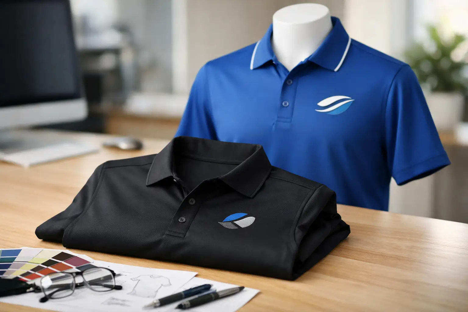
Choose the right shirt before you design the graphic
The garment is part of the design. A sharp logo cannot rescue a poor shirt choice.
For a polished, everyday business look, polos are often the safest choice. They present well across departments, work for office and customer-facing teams, and translate cleanly with embroidery. For more casual branding, t-shirts and lightweight performance shirts can make sense, especially for events, promotions, or active crews. For tougher environments, work shirts, outerwear, or heavier-duty styles may be the better investment.
Fit also matters more than buyers sometimes expect. If your workforce includes a wide size range, choose styles with inclusive sizing and a cut that works for different body types. Shirts that fit poorly tend to stay in drawers, which defeats the purpose of branded apparel. Softness, stretch, and breathability all influence whether employees will actually wear the piece beyond the first issue.
Color deserves just as much attention. It is tempting to default to your brand’s primary color, but a shirt has to flatter the wearer and support the logo. A navy polo with clean embroidery often feels more premium and wearable than a bright shirt with too much contrast. Dark colors can look strong and professional, but they may feel warmer in the field. Light colors can feel cleaner and cooler, but they may show stains faster. There is no universal best option. It depends on your workplace and your audience.
Build the design around brand clarity
Company shirts work best when they are unmistakably branded without feeling overdesigned. In most cases, less performs better.
A left chest logo remains the standard for a reason. It is clean, recognizable, and appropriate across industries. It also works well on polos, woven shirts, outerwear, and many uniforms. If you want a stronger branded effect, a full back print or larger front graphic can work for tees and event apparel, but scale should still feel intentional. Bigger is not always better.
If your existing logo is detailed, test whether it will reproduce clearly at shirt size. Fine lines, tiny taglines, gradients, and small type often lose impact when embroidered or printed on fabric. Sometimes the best move is to create a simplified apparel version of the logo. That is not compromising the brand. It is adapting it for the medium.
Typography and messaging need the same discipline. A company name and logo may be enough. If you add a slogan, department name, website, employee title, or location identifier, make sure each element earns its place. Crowded shirts look less professional and are harder to produce cleanly.
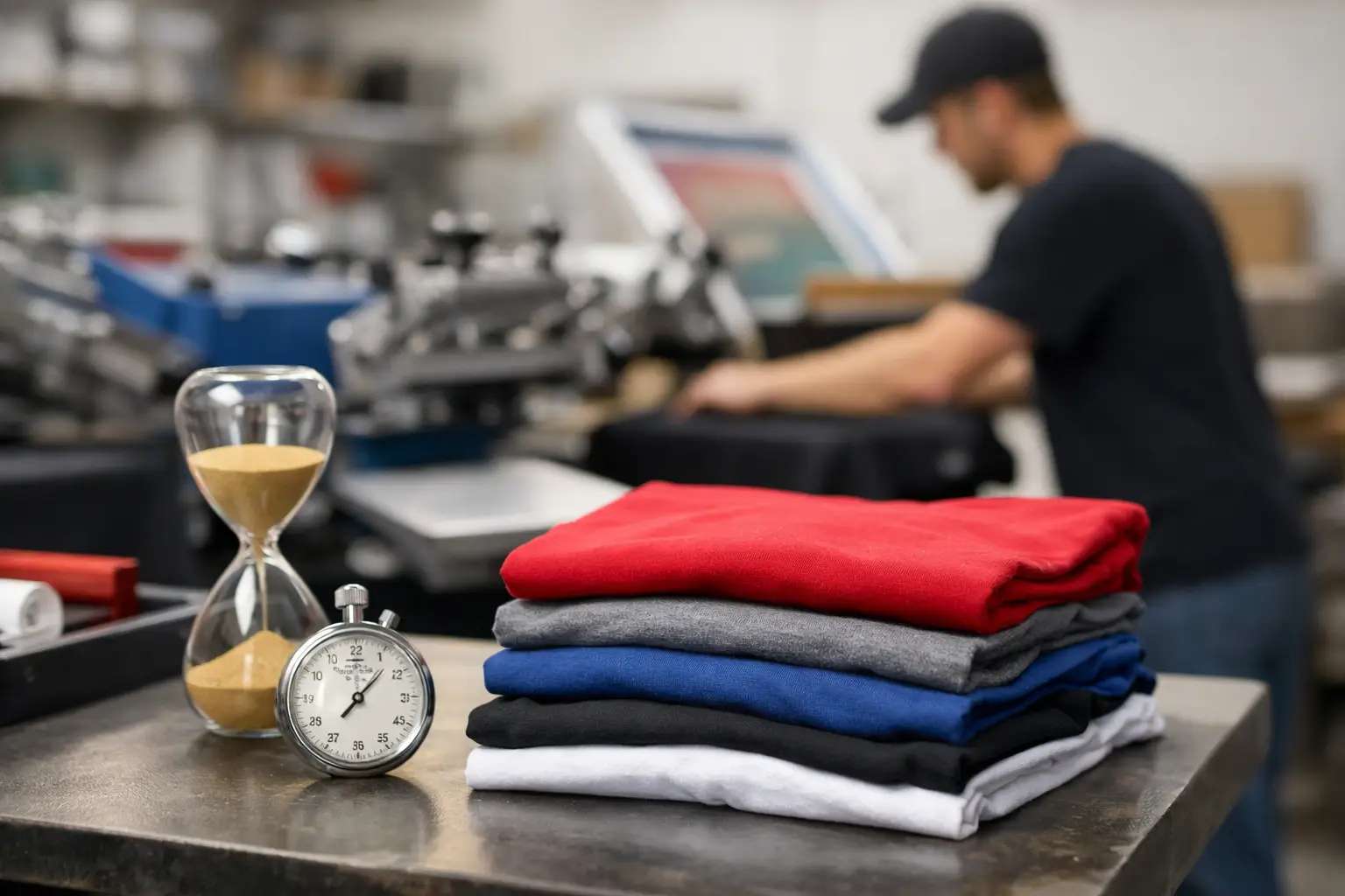
Embroidery vs. screen print: pick the method that fits the shirt
Decoration method changes both the look and the lifespan of the finished piece.
Embroidery is usually the right choice for polos, caps, outerwear, bags, and many uniforms. It gives the logo texture, dimension, and a more elevated corporate appearance. It also holds up well over time, especially on structured garments. The trade-off is that very intricate logos may need adjustment, and embroidery is not ideal for oversized graphics or designs with lots of tiny color changes.
Screen printing is often the better fit for t-shirts, sweatshirts, and promotional apparel with larger artwork. It handles bold graphics, bigger prints, and certain multi-color designs more naturally. It can also create a softer or more casual look, depending on the ink and garment. The trade-off here is that print size, placement, and fabric compatibility matter a lot. What looks great on a cotton tee may not behave the same way on every performance fabric.
If you are managing a mixed apparel program, you may need both methods. That is common and often smart. A field team might wear embroidered polos for daily use and printed tees for events or seasonal campaigns.
Keep logo placement practical
Placement affects both appearance and comfort. The most common options are left chest, full front, full back, sleeve, and hat front, but the right location depends on the shirt style and the job it needs to do.
For uniforms and corporate apparel, left chest is the most versatile choice. It looks professional, leaves room for layering, and stays visible in person. Full back prints are helpful when you want visibility from a distance, such as at events, on job sites, or in warehouse settings. Sleeve prints can add a subtle branded detail, but they should support the main design, not compete with it.
Be careful with oversized front prints on premium corporate apparel. What works for a concert shirt rarely works for a client-facing team. If your goal is polished brand presentation, cleaner decoration usually wins.
Plan for repeat orders and brand consistency
One shirt order is easy. A long-term apparel program is where consistency matters.
If multiple departments, locations, or managers will place orders over time, standardize the details now. Decide on approved garment styles, exact shirt colors, logo versions, placement, and decoration method. That prevents future reorders from drifting away from the original look.
This matters even more for growing businesses. The shirt you create today may become the baseline for onboarding kits, trade shows, branch offices, and seasonal staff. When artwork, thread colors, print placement, and garment selection are handled consistently, your brand looks organized and established.
A digital proof is a valuable checkpoint here. It gives you the chance to confirm scale, positioning, color, and readability before production begins. That step can save time, money, and frustration, especially on larger orders.
Common mistakes when designing company shirts
The biggest mistake is trying to say too much on one garment. Too many logos, too much copy, or too many placement locations can turn a clean design into visual noise.
Another issue is ignoring the garment’s real use. A premium polo is not the right answer for every team, just as a basic tee is not the right answer for every brand impression. The shirt has to fit the job.
Low-contrast design is another frequent problem. A dark logo on a dark shirt or a small logo on a textured fabric can disappear. Always think about readability from a few feet away, not just on a screen.
And finally, do not treat turnaround as an afterthought. Good design still needs production-ready artwork, proof approval, and enough lead time to decorate the shirts properly. A dependable partner with in-house experience can help catch issues before they become expensive mistakes.
A better way to approach your next shirt order
If you want company shirts that feel like an asset rather than an obligation, design them like part of your brand system. Start with the wearer. Choose a garment that fits the work. Use decoration that suits the fabric and the logo. Keep the design clean enough to look professional now and consistent enough to reorder later.
That approach is why experienced buyers tend to get better results over time. They stop asking what shirt is cheapest and start asking what shirt will represent the company well, wear comfortably, and hold up through real use. At LOGO USA, that difference shows up in the final product.
The right company shirt should make your team look ready, your brand look established, and your ordering process feel a lot easier the next time around.
Popular Blogs
Custom Apparel Turnaround Time Explained
June 8, 2026