Best Logo Placement for Uniforms at Work
- August 29, 2026
- 6:01 am
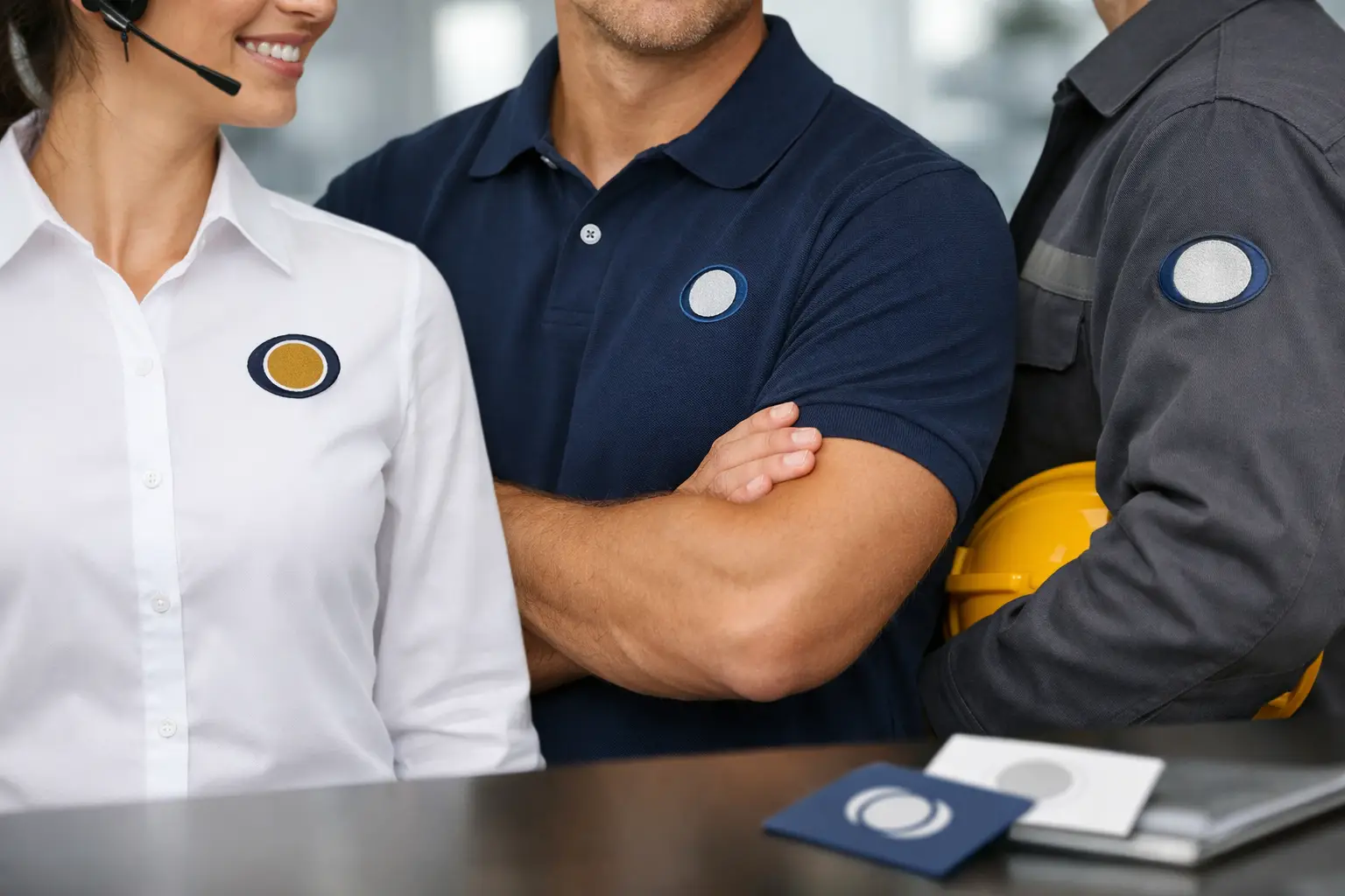
A uniform can make a team look organized before anyone says a word. But even premium polos, work shirts, jackets, and safetywear can miss the mark when the logo is too small, poorly positioned, or placed where it disappears in normal wear. The best logo placement for uniforms balances brand visibility with comfort, garment construction, and the way employees actually do their jobs.
For most organizations, the left chest is the dependable starting point. It is familiar, professional, and easy to recognize in person. Still, it is not the automatic answer for every garment or every role. A field crew in high-visibility outerwear, a restaurant team working face-to-face with guests, and a trade show staff wearing branded tees may each need a different placement strategy.
Why Logo Placement Affects More Than Appearance
Logo placement shapes how consistently your brand is seen across a workforce. A logo that sits neatly on a polo may need to move or scale differently on a jacket, button-down, hoodie, or cap. When every garment is decorated without a plan, the result can feel like a collection of unrelated items rather than one polished uniform program.
Placement also affects durability and wearability. Embroidery through a heavy jacket seam can create an uneven result. Large screen prints may not be appropriate for employees who work in professional client settings. A logo placed under a safety vest may technically be present but offer little daily brand exposure.
The right choice depends on the garment, the logo shape, the decoration method, and the setting. Start with the job the uniform needs to do, then select a placement that supports it.
The Best Logo Placement for Uniforms by Garment
Left chest: the professional standard
The left chest is the most common placement for corporate uniforms, especially polos, woven shirts, quarter-zips, fleece layers, and workwear. It creates a clean, credible look without overpowering the garment. This position works particularly well for embroidered logos because the smaller decoration area keeps stitching crisp and durable.
For office teams, hospitality staff, sales representatives, and service technicians, a left-chest logo is usually the best choice. It keeps the brand visible during customer conversations, meetings, and day-to-day work while allowing the apparel to remain professional.
A typical left-chest design is modest in scale. Oversizing the artwork can pull the fabric, make a shirt feel less refined, and reduce readability. Wide logos may need a simplified layout or a different location to avoid looking cramped.
Full back: built for distance and identification
A full-back logo is highly effective for crews who need to be recognizable from a distance. Construction teams, delivery drivers, event staff, maintenance personnel, security teams, and outdoor service professionals often benefit from prominent back decoration.
Screen printing is commonly used for large back logos because it provides strong coverage and accommodates bigger artwork efficiently. Back decoration can include a company name, a bold icon, a service descriptor, or a phone number when appropriate for the application.
The trade-off is formality. A large back print can be ideal for field uniforms and promotional tees but may feel too casual for executive-facing or hospitality environments. Many companies pair a small left-chest logo with a full-back design to achieve both close-range professionalism and long-range visibility.
Center chest: strong for casual and event apparel
Center-chest decoration gives a logo the most immediate visual impact from the front. It is a natural fit for event t-shirts, team shirts, promotional apparel, and casual employee uniforms. A centered design is easy to see in group photos and works well when the artwork is designed to be a focal point.
This placement is less common for traditional business polos and button-downs, where it can appear too bold. It also requires careful consideration around garment features. Zippers, plackets, pockets, and layered outerwear can interrupt the design area. On a quarter-zip or full-zip jacket, a left-chest location is typically the cleaner option.
Right chest: useful for secondary branding
The right chest is often used alongside a primary left-chest logo. It can hold an employee name, department name, certification, sponsor mark, or a small supporting graphic. For customer-facing teams, embroidered names on the right chest can make interactions more personal without competing with the company logo.
Avoid placing two similar-sized logos on both sides of the chest unless the garment serves a specific event or sponsorship purpose. Too much decoration in the front can look crowded. Give the company logo a clear priority.
Sleeves: a smart space for programs and partners
Sleeve placement is valuable when the front needs to stay clean. A sleeve can carry a secondary logo, flag, location identifier, campaign message, or anniversary mark. It is a popular choice for uniforms with a primary left-chest logo and for organizations that need to recognize sponsors or divisions.
Sleeves have less usable space than they appear to have. Artwork should be simple, readable, and sized for the garment. Embroidery can work well on many sleeves, although seams and fabric weight must be considered. On lighter performance apparel, a printed design may preserve comfort better than dense embroidery.
Caps and headwear: visibility at eye level
For crews who work outdoors or move between job sites, caps are often one of the most visible uniform pieces. The front center panel is the primary placement for a company logo, while side and back placements work well for secondary marks.
Hat structure matters. A clean, bold logo with limited detail generally produces the strongest embroidered result, especially on structured caps. Consider where employees will be seen: a front logo is most effective in direct interaction, while a rear logo may add value when staff are working away from customers.
Match Placement to the Employee’s Role
Uniforms should support the work, not just display a logo. A receptionist, technician, warehouse associate, and event ambassador represent the same company in different ways.
For office and client-facing roles, use restrained placement: left chest embroidery on polos, woven shirts, cardigans, or outerwear usually delivers the right level of polish. For mobile service teams, add a larger back logo so customers can identify employees at a property, job site, or community event. For warehouse and production teams, consider visibility requirements first. A logo can be placed on the chest or back of safety apparel, but it should not interfere with reflective striping, pockets, or required compliance features.
If your team wears layers, plan the program as a system. A left-chest logo on polos, jackets, vests, and fleece creates a consistent look even when temperatures change. The logo may require slight size or position adjustments from one garment to another, which is normal. Consistency means the finished pieces look intentional, not that every measurement is identical.
Choose a Decoration Method That Supports the Placement
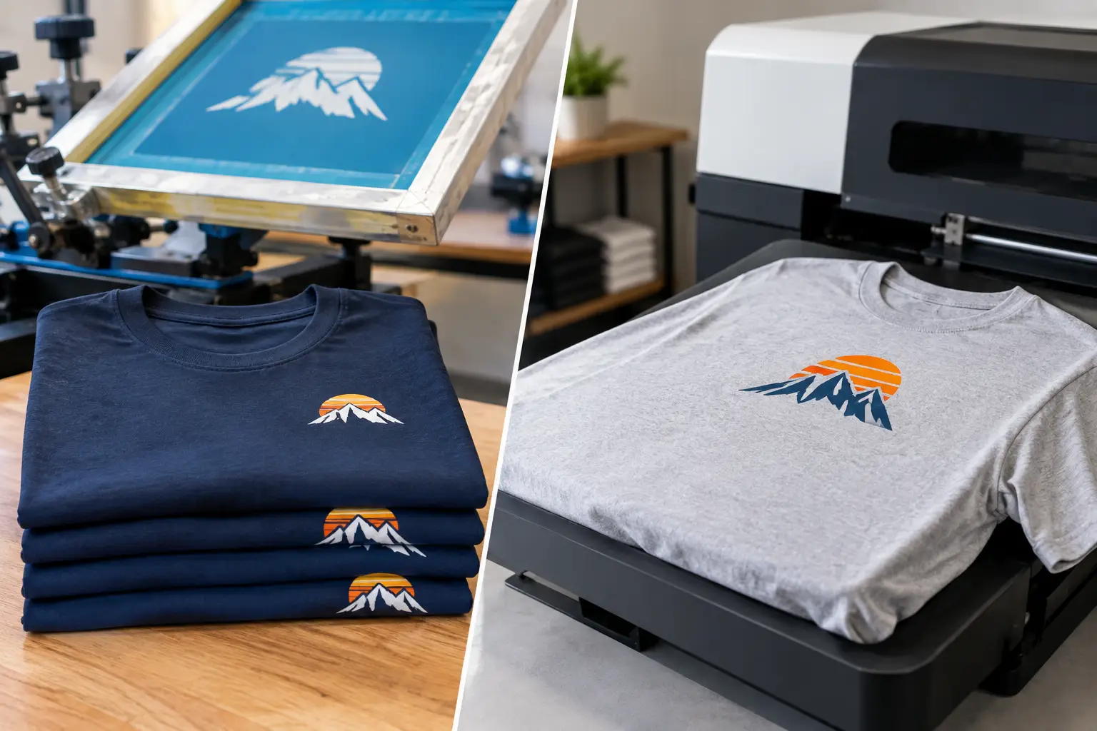
Embroidery gives corporate uniforms a dimensional, long-lasting finish. It is especially well suited to left-chest logos, cap fronts, sleeve details, and heavier fabrics such as polos, jackets, fleece, and work shirts. Fine lines, tiny type, and intricate color changes may need to be simplified before digitizing so the logo remains clear in thread.
Screen printing is often the better choice for full-back graphics, large center-chest art, and high-volume t-shirt programs. It is flexible, vibrant, and well suited to designs that need broad coverage. For lightweight performance fabrics, the right print approach can also feel less bulky than embroidery.
The best production decision is not always the decoration method you have used before. A design that looks excellent embroidered on a polo may reproduce better as a screen print on a moisture-wicking tee. Reviewing the art against the actual garment prevents disappointing results after production begins.
Avoid These Common Placement Problems
The most common issue is choosing a position based only on a digital mockup. Garments have seams, pockets, zippers, buttons, curves, and varying fabric weights. A placement that looks centered on a flat image may shift once the garment is worn.
Another problem is treating every logo file the same. A horizontal company name may need a left-chest treatment, while a circular emblem may look better on a sleeve, cap, or center chest. Your primary logo, icon, and secondary mark can each have a useful role in the uniform program.
Finally, do not overlook apparel color. A dark embroidered logo can disappear on a dark garment, while a light print may lack contrast on heathered fabric. Use thread or ink colors that remain legible from a practical viewing distance. Brand standards matter, but visibility matters too.
Build a Consistent Uniform Standard
The easiest way to simplify future orders is to document a few approved combinations. For example, your standard may be left-chest embroidery on polos and outerwear, front-center embroidery on caps, and left chest plus full-back printing on field-service tees. This gives new employees, departments, and locations a consistent framework while keeping reorders efficient.
Before production, request a digital proof that shows the selected garment, logo size, location, and thread or ink colors. This is the point to confirm that the artwork is readable, the placement clears garment details, and each item matches the role it is intended for. LOGO USA can help evaluate those decisions across embroidered and screen-printed apparel, from a straightforward staff order to a larger branded uniform program.
A well-placed logo does not need to shout. It needs to be easy to see, appropriate for the job, and repeated with care across every piece your team wears. That is how uniforms become a reliable part of your brand experience.
Popular Blogs
What File Formats Does Embroidery Accept?
October 12, 2026