Best Logo Placement on Work Shirts
- April 29, 2026
- 1:27 am
A work shirt has seconds to do its job. Before your team says a word, the shirt signals whether your company looks organized, credible, and ready for business. That is why logo placement on work shirts matters more than many buyers expect. The right placement helps your brand read clearly, wear comfortably, and hold up across different job roles, shirt styles, and decoration methods.
For business buyers, this is not just a design choice. It affects day-to-day appearance, employee acceptance, and the long-term consistency of your uniform program. A logo that looks balanced on a polo may feel oversized on a button-down. A placement that works at a trade show may not be ideal for technicians in the field. Good decisions upfront save time, reduce rework, and create a cleaner branded look across every order.
Why logo placement on work shirts matters
Most companies start with the logo itself, but placement is what makes the logo function well on apparel. Even a strong mark can look off-center, too large, or hard to read if it is placed without considering the shirt construction and the work environment.
Placement also affects how professional the garment feels. On employee uniforms, a logo should look intentional, not like an afterthought. If it sits too low, competes with pockets or seams, or gets distorted across different shirt sizes, the whole program can feel inconsistent. That is a problem for companies trying to present a polished brand image across multiple locations or teams.
There is also a practical side. Work shirts are worn in motion. People bend, lift, drive, greet customers, and layer jackets over them. The best placement is one that stays visible and attractive during real use, not just on a flat mockup.
The most common logo placements
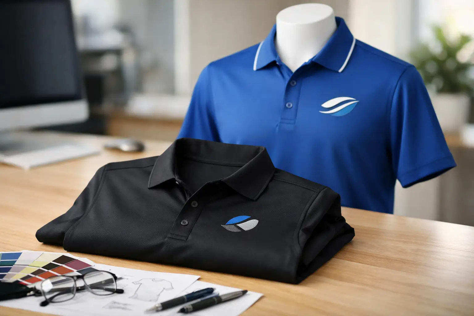
The left chest remains the standard for a reason. It is clean, professional, and widely accepted across industries. For polos, button-downs, work shirts, and outerwear, left chest decoration gives you a branded look without overwhelming the garment. It works especially well for embroidered logos because the area is stable, visible, and scaled appropriately for business branding.
Right chest placement is less common, but it can make sense when a left chest pocket interferes with decoration or when the shirt design calls for a balanced alternative. It is also used in cases where a name or title is added on one side and the logo goes on the other.
Full front decoration is usually more common on promotional tees than on professional work shirts. It creates strong visibility, but it can look too casual for uniforms in customer-facing environments. For some industries, that is fine. For others, it can work against the polished presentation you want.
Back placement is useful when visibility from a distance matters. Delivery crews, construction teams, event staff, and warehouse personnel often benefit from a larger logo or company name on the back. Still, back prints are not always necessary. If your team regularly wears jackets, safety vests, or tool harnesses, the back may be covered most of the day.
Sleeve logos can add a premium branded detail, especially for more elevated corporate apparel or branded outerwear. They are usually best as a secondary placement, not the primary one. A sleeve hit can support the brand, but it rarely replaces the clarity of a chest logo.
Left chest is the default – but not always the best choice
For many companies, left chest embroidery is the right answer. It is dependable, professional, and works across a wide range of garments. If you are building a uniform program that includes polos, woven shirts, quarter-zips, and jackets, left chest placement creates consistency with minimal risk.
But there are exceptions. If your logo is unusually wide, highly detailed, or built around small text, shrinking it for left chest embroidery may compromise legibility. In that case, you may need to simplify the art, adjust the logo lockup, or choose a larger placement on another garment style.
Job function matters too. A service technician shirt may need a name on one side and a logo on the other. A retail team may benefit from a cleaner, more minimal logo size. A construction crew may need stronger visibility with a back logo in addition to the front chest mark. The best answer depends on who is wearing the shirt and how the shirt is used.
Choosing the right logo size
Placement and size work together. A well-placed logo that is too small can disappear. One that is too large can look promotional instead of professional.
For left chest embroidery, many business logos fall into a range that feels readable without taking over the shirt. Exact sizing depends on the shape of the artwork, the amount of text, and the shirt size range in the order. A compact emblem behaves differently than a horizontal wordmark. That is why digital proofing matters. You want to see how the logo scales on the actual garment area before production begins.
There is a trade-off here. Larger logos improve visibility, but they can also feel heavy or stiff in embroidery, especially on lighter-weight shirts. Smaller logos feel more refined, but they can lose detail if the artwork is complex. If your mark includes fine lines or small lettering, it may need to be adapted specifically for embroidery rather than used exactly as it appears in print.
Decoration method changes the placement strategy
Embroidery and screen printing do not behave the same way, and that affects placement decisions.
Embroidery is the preferred choice for many work shirts because it delivers a premium, durable finish. It holds up well on polos, woven shirts, outerwear, and many uniform pieces. It also gives logos a polished, dimensional look that aligns well with corporate branding. Because embroidery adds stitch density and texture, it tends to perform best in placements like the left chest, sleeve, or cap front where the design area is controlled.
Screen printing is often better for larger graphics, bigger back logos, or more casual workwear like t-shirts. It can reproduce broader artwork with less bulk, and it is often the better fit when the logo needs to be bold and highly visible from a distance. The trade-off is that it may not deliver the same elevated uniform appearance as embroidery on certain garment types.
The shirt fabric matters as well. Lightweight performance polos, heavy-duty work shirts, fleece layers, and safety apparel all respond differently to decoration. A placement that looks clean on a smooth polo may not sit the same way on a jacket with seams, pockets, or panels.
Watch the shirt construction
One of the most common mistakes in logo placement on work shirts is ignoring the garment build. Pockets, plackets, yokes, seams, and fabric texture can all interfere with decoration.
A left chest logo on a pocketed work shirt needs careful positioning so it does not look crowded or awkward. On some garments, the pocket itself may limit what is possible. On others, the fabric panels may shift the visual center, which means a mathematically centered logo may still look off when worn.
This is where experience matters. Good placement is not just measuring from the collar and calling it done. It is understanding how the shirt hangs on the body, how the seams frame the logo, and how the decoration will look across small through extended sizes.
Consistency matters across a uniform program
If you are ordering for a team, think beyond one shirt. The goal is not just to make a single garment look good. The goal is to make your brand look consistent across polos, button-downs, outerwear, tees, and workwear.
That may mean using the same left chest placement across multiple styles, even if the exact dimensions shift slightly based on garment construction. It may also mean creating decoration standards for front logo size, back logo use, thread colors, and name personalization. These details make reorders easier and help different departments or locations stay aligned.
For growing companies, consistency becomes even more valuable over time. It reduces guesswork, shortens approval cycles, and helps every new order match the appearance of previous runs. That is a major advantage when you are outfitting new hires, field teams, trade show staff, or multi-site operations.
How to make the right choice the first time
Start with the role of the shirt. Ask whether the garment is meant for front-line service, office staff, field visibility, event branding, or a mix of uses. Then consider the logo itself. Is it compact and embroidery-friendly, or wide and detail-heavy? Finally, match the placement to the garment construction and the decoration method.
For many buyers, the safest route is a left chest embroidered logo supported by a proofing process that confirms size and placement before production. If the shirt needs more visibility, adding a back logo can make sense. If the logo is too detailed for embroidery, screen printing or art adjustment may be the better move.
This is one area where hands-on support pays off. A trusted production partner can flag issues early, recommend the right decoration method, and help standardize placements across your apparel program. That is how companies avoid costly surprises and get work shirts that look sharp from the first wear to the hundredth.
When your logo is placed with care, the shirt does more than carry a brand. It reinforces trust every time your team shows up.
Popular Blogs
How to Design Company Shirts That Look Sharp
June 10, 2026