Logo Placement on Polos: What Looks Best?
- August 17, 2026
- 4:21 am
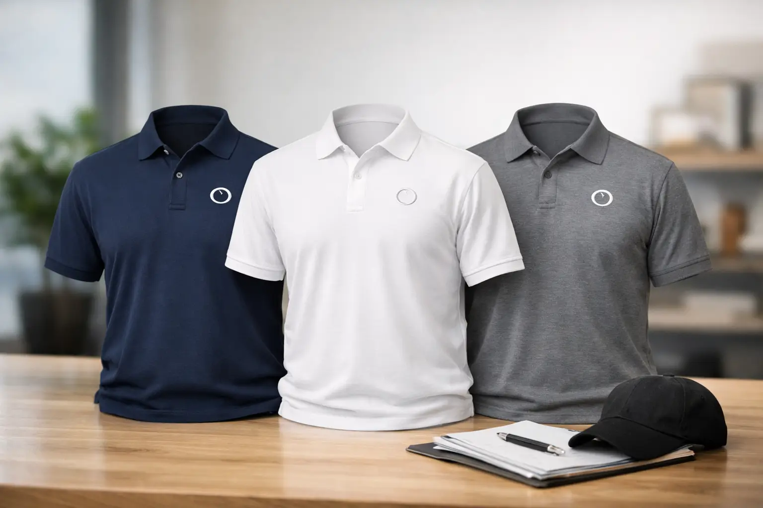
A polo can make a company uniform look established, organized, and ready for customer-facing work. But logo placement on polos is what separates a polished program from apparel that feels like an afterthought. The right location gives your mark room to be recognized without competing with the garment’s fit, collar, buttons, or performance features.
For most businesses, the left chest is the dependable answer. It is familiar, professional, and easy to standardize across departments, sizes, and future reorders. Still, it is not the only option. A field service crew, golf event team, hospitality staff, or executive apparel program may each call for a different approach.
Why Polo Logo Placement Deserves Planning
A logo is not simply applied to a blank shirt. It has to work with the garment’s construction, the decoration method, and the way people wear it during a full day of work. Placing a design too low can make it disappear when the polo is tucked in. Placing it too high can crowd the collar or look uneven on smaller sizes. A logo that is oversized may feel promotional rather than professional.
Consistency matters just as much. When a customer sees ten employees wearing the same branded polos, they should see one cohesive team. Clear placement standards help ensure that an embroidered mark looks intentional whether it appears on a men’s, women’s, performance, workwear, or big-and-tall style.
For programs that grow over time, a documented placement choice also makes reorders easier. You do not want each new batch of uniforms to look slightly different because the logo position was not specified from the start.
The Standard Choice: Left-Chest Logo Placement on Polos
The left chest is the most common location for corporate polos, and for good reason. It sits within a natural visual area, reads well in face-to-face conversations, and works with most business logos. It is a strong choice for office teams, sales representatives, medical practices, retail associates, property management teams, and many service businesses.
For embroidered polos, a typical left-chest design is often around 3 to 4 inches wide, depending on the shape of the logo and the garment size. A wide horizontal logo may need to be scaled differently than a compact emblem. Height matters, too. A tall design that approaches the buttons or collar can feel crowded even if its width seems modest.
Professional decorators usually place the design relative to garment landmarks rather than relying on a fixed distance from the neckline alone. This approach accounts for different polo sizes and cuts, helping the mark appear balanced from one shirt to the next.
When the Left Chest Needs Adjustment
Some polos have details that affect placement. A chest pocket, contrast placket, curved seams, zip collar, or color-blocked panel may make the standard position impractical. In those cases, the best-looking placement may be above a pocket, on the opposite chest, or in another approved location.
Women’s polos can also have a different fit and button-placket position than men’s styles. The goal is not to force every garment into the exact same measurement. The goal is to maintain the same visual relationship between the logo and the wearer’s chest area.
Other Polo Logo Locations That Work
The left chest may be the default, but other placements can support a specific branding goal. The key is choosing them for a reason, not simply because they are available.
Right Chest
A right-chest logo can work well when the left chest is reserved for a name, title, award designation, or partner logo. It is also useful for designs that need to align with a pocket or garment feature on the opposite side. For most corporate uniform programs, however, right chest is best used as a deliberate exception rather than the new standard.
Sleeve
Sleeve decoration is a clean secondary option. It can be effective for a website, short tagline, event sponsor, division name, or smaller supporting mark. A sleeve logo is visible from the side and adds detail without overwhelming the front of the polo.
There are trade-offs. Sleeve areas are smaller and curved, so fine details may not reproduce well in embroidery. A large sleeve design can also feel busy, particularly when the front already includes a prominent logo. Keep supporting sleeve artwork simple and readable.
Back Yoke or Upper Back
A logo across the upper back can deliver high visibility for teams that spend time moving through job sites, trade shows, restaurants, or outdoor events. It is especially useful for delivery crews, maintenance teams, security staff, and event personnel.
Upper-back decoration works best with a concise logo or wordmark. Full-size back artwork is more common on T-shirts than polos, and it can make a polished uniform polo feel too casual. Consider whether the wearer will regularly carry a bag, wear a jacket, or sit against a chair back, since these situations can cover or rub against the design.
Collar and Nape
Small collar or nape logos can create a premium, retail-inspired finish. They are usually best as an accent rather than the primary branding location. This placement is ideal for executive gifts, golf apparel, company stores, and higher-end event merchandise where subtle details matter.
Not every logo is suited to this space. Small text, thin lines, and detailed artwork may lose clarity. If the primary goal is brand recognition at a glance, the left chest remains the stronger choice.
Match the Placement to the Decoration Method
Embroidery is a natural fit for polos because it delivers texture, durability, and a professional uniform appearance. It performs especially well for simplified logos, clear lettering, and designs with defined shapes. A properly digitized embroidery file is essential. Digitizing tells the embroidery equipment how to build the design in thread, and it affects detail, coverage, and the finished feel of the logo.
Very small lettering or intricate gradients may not translate cleanly to thread. In those cases, simplify the mark, use a larger placement, or consider a printed option if the garment and artwork support it. Trying to force tiny details into a small embroidered chest logo often produces a result that is harder to read, not more impressive.
Screen printing can be appropriate for select polo programs, especially for larger event orders, bold graphics, or designs with wide areas of solid color. It generally works best on smoother cotton or cotton-blend fabrics. Performance polos need added care because heat, fabric stretch, and moisture-wicking finishes can affect decoration choices.
The garment should guide the method. A lightweight performance polo may call for a different approach than a heavyweight cotton pique polo. This is where working with an experienced in-house production team helps prevent avoidable issues before the order reaches production.
Size, Readability, and the Wearer’s Comfort
The most effective logo is not always the biggest one. On a polo, a restrained chest design often projects more confidence than an oversized graphic. Your logo should be recognizable from a reasonable distance while still fitting the garment’s proportions.
Consider the people wearing the polos. Employees may wear them tucked in, layered under outerwear, or paired with name badges. If the logo sits too low, it can be hidden by a badge or waistband. If it extends too far toward the center of the chest, it may feel awkward or distort when the fabric moves.
Artwork with a lot of text needs particular attention. A long company name, phone number, and website may be too much for a chest location. Often, a logo or company name on the front with additional information on the sleeve or upper back is easier to read and more comfortable to wear.
Build a Placement Standard Before You Order
Before approving artwork, decide what must remain consistent across the program: logo version, thread or ink colors, primary location, decoration size, and any secondary placement. This matters if you plan to order polos in multiple colors, add new employees later, or expand the program to jackets, caps, and work shirts.
A digital proof should show more than the logo itself. Review the logo’s placement on the exact garment style and color whenever possible. Check that the colors have enough contrast, the logo is clear at its proposed size, and the location avoids seams, pockets, plackets, and panels.
For larger organizations, it is smart to define a primary uniform polo and a placement rule for approved alternatives. For example, the standard may be an embroidered left-chest logo, while the sleeve is reserved for department branding or event sponsorship. That simple decision protects brand consistency as the program evolves.
LOGO USA helps businesses turn these decisions into polished decorated apparel with artwork support, digital proofs, and USA-based production. Whether you are outfitting a small office or managing a recurring uniform program, the best result starts with choosing a placement that looks right on the people who will wear it.
A polo is a practical piece of branded apparel, but it also represents your company wherever your team goes. Choose a logo position that is clear, balanced, and comfortable, then keep that standard in place. Your team will look more unified, and your brand will be easier to recognize.
Popular Blogs
What File Formats Does Embroidery Accept?
October 12, 2026