Tonal Embroidery: The Ultimate Guide to Sophisticated Corporate Branding
- January 23, 2026
- 10:00 pm
In today’s corporate landscape, branding does not need to shout to be powerful. The most respected companies in 2026 understand that authority is communicated through refinement, not noise. Tonal embroidery embodies this shift by transforming logos into subtle, textural signatures rather than bold promotional marks. When thread perfectly complements fabric, branding becomes an integrated design element instead of an overlay.
Modern professionals increasingly reject oversized, high-contrast logos in favor of understated sophistication. They want apparel that feels premium, wearable, and aligned with luxury retail standards. Tonal embroidery achieves this by using depth, stitch direction, and light reflection to create visibility without obvious contrast.
This technique allows corporate branding to feel intentional and elevated. Instead of relying on bright colors to capture attention, tonal embroidery uses texture and dimension to invite closer inspection. The result is apparel that signals confidence, craftsmanship, and long-term brand maturity.
This guide will walk you through the strategy, psychology, and production principles required to execute tonal embroidery at a professional level.
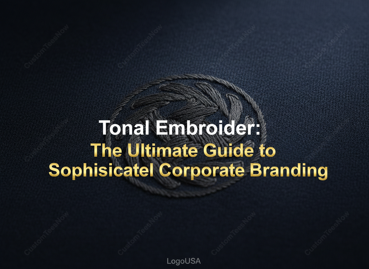
What is Tonal Embroidery?
Tonal embroidery is a sophisticated way to brand through physical texture. It is often called tone-on-tone, but the technique involves more than just color choice. In professional production environments, tone on tone embroidery requires precise thread matching and stitch control to ensure the logo remains visible through texture rather than contrast. We focus on manipulating light and complex stitch architecture. This process ensures the design remains visible through physical depth instead of high contrast. The result is a premium look that highlights the garment’s superior quality.
The Mechanics of Tone-on-Tone
Contrast in this style relies entirely on light reflection and stitch direction. We tilt the thread at specific angles to catch the light differently across the surface. This technique creates a subtle shadow effect that defines the logo against the base fabric. You do not need color variance when you master the natural play of light. The design appears to shift and move as the wearer changes position.
Tonal vs. Monochromatic
| Feature | Tonal Embroidery | Monochromatic Embroidery |
| Color Match | Surgical match to the fabric | Single color (can be a contrast) |
| Visibility | Dependent on light and texture | Dependent on the color value |
| Aesthetic | Subtle and integrated | Uniform but often distinct |
Many people confuse these two terms during the initial design process. Monochromatic designs use one single color, which might still stand out against the material. Tonal Embroidery requires a perfect match to the specific substrate of the clothing. This level of precision ensures the branding remains truly understated and elegant.
The Psychology of Subtle Branding
The “less is more” philosophy now defines premium corporate identity in the modern world. Avoiding loud logos builds a strong sense of exclusivity for your organization. High-end positioning relies on the idea that true quality speaks for itself. This understated approach signals a confident, established brand. It suggests your company values substance over flashy advertisements.
Shifting from Promotion to Fashion
Modern employees prefer wearing retail-inspired pieces over traditional promotional gear. No one wants to feel like a walking billboard during their daily commute. Tonal Embroidery allows corporate apparel to feel like high-end fashion rather than a work uniform. This style increases the likelihood that your team will wear the clothing outside of the office. You build brand affinity by providing garments that people actually find stylish and comfortable.
Key Benefits for Corporate Identity
Tonal branding offers a strategic advantage by creating a cohesive and professional appearance. This style does not date as quickly as high-contrast trends that fade from fashion. It ensures your team looks unified while maintaining a high-end corporate image. Investing in tonal embroidery strengthens long-term corporate embroidery branding strategies by aligning visual identity with luxury presentation standards. This approach protects your brand from looking obsolete in a fast-moving market.
Versatility Across Dress Codes
A tonal logo transitions seamlessly between different levels of corporate formality. It looks just as polished on a casual weekend hoodie as it does on an executive vest. This flexibility allows your branding to remain consistent across various departments and events. You maintain a premium feel whether the setting is a boardroom or a casual retreat.
Enhanced Longevity
Tonal designs remain timeless because they do not rely on trendy color pairings. This ensures your apparel investment lasts for years without clashing with future palette changes. The subtle stitching keeps the garment relevant as styles evolve. You save costs by choosing a design that survives shifting aesthetic standards.
Best Fabrics for Tonal Embroidery
The base texture of a fabric dictates how the final design will appear. Certain materials allow the tone-on-tone effect to pop, while others might cause it to sink. You must select your substrate carefully to achieve the desired level of visibility. The interaction between the thread and the textile creates the final masterpiece.
Piqué and Performance Knits
The bumpy texture of a piqué polo shirt creates a beautiful contrast with smooth embroidery. Dense stitches sit on top of the knit, uniquely catching light. This creates a clear boundary for the logo without using a different color. Performance fabrics also benefit from this technique by maintaining their professional edge.
Outerwear and Softshells
Using tonal designs on premium softshell jackets maintains a sleek and technical aesthetic. These garments often feature smooth, weather-resistant surfaces that pair well with matte threads. The embroidery adds a layer of sophistication without disrupting the jacket’s clean lines. It reinforces the outerwear’s high-performance feel while maintaining a professional brand.
Selecting the Perfect Thread Colors
Matching thread to fabric is a science that involves light refraction and precise color theory. You must understand how different fibers reflect light to achieve the desired effect. We often use the “One Shade Off” rule to ensure the design remains visible. This careful selection process ensures your Tonal Embroidery looks intentional rather than like a production mistake.
The ‘One Shade Off’ Rule
Sometimes an exact color match causes the logo to disappear entirely into the fabric. We often choose a thread that is 10% darker or lighter than the material. This slight shift creates enough contrast to define the logo’s edges. It provides just enough shadow to make the branding legible from a short distance.
Matte vs. Lustre Threads
The finish of your thread significantly affects the final design’s visibility. Shiny trilobal polyester threads catch the light, creating a metallic glow against matte fabrics. Flat matte threads offer a more subtle, rugged look that blends into natural fibers. Choosing the right lustre allows you to control how much the branding stands out.
Design and Digitizing Considerations
Without color contrast, the digitizer’s path becomes the only way to define the logo’s shape. We must plan the direction of every stitch to create artificial shadows. The goal is to use texture to compensate for the lack of visual color cues. Proper digitizing ensures the logo retains its integrity on any garment type.
Increasing Stitch Loft
We often use high-density stitching or foam to make the logo physically stand out from the fabric. This increased loft adds a three-dimensional quality that catches overhead lighting. A thicker stitch count provides a premium feel that you can actually touch. This physical depth is essential for maintaining brand recognition in a tonal format.
Simplifying Fine Details
Complex gradients and tiny text should be stripped back for tonal success. You should focus on clean outlines and bold fills to ensure the design remains sharp. Small details often get lost when there is no color difference to separate them. Simplifying the art ensures the final product looks professional and clean.
Tonal Embroidery for Different Industries
This branding style works across various sectors, from high-tech offices to luxury hotels. It provides a versatile solution for companies that want to maintain a premium image. Tonal Embroidery bridges the gap between traditional uniforms and high-end fashion. It allows brands to express their identity without compromising on style.
The Tech and Finance Sectors
Silicon Valley and venture capital firms prefer the “stealth” look for their corporate gear. These industries value a modern aesthetic that feels innovative yet grounded. A subtle logo on a high-quality vest or jacket signals power and intelligence. It fits the “if you know, you know” branding culture.
Luxury Hospitality
Luxury hotels use tonal designs to create uniforms that feel like high-end concierge wear. Staff members look more like personal assistants than traditional workers. This elevates the guest experience by providing a more refined visual environment. It reinforces the premium nature of the service being provided.
Comparing Tonal to Other Branding Methods
Embroidery is the superior choice when you want a high-quality tone-on-tone look. It offers a level of durability and texture that other methods simply cannot match. The thread’s physical nature adds value to the garment itself. It transforms a standard piece of clothing into branded art.
Tonal Embroidery vs. Screen Printing
Tonal screen printing often looks like a faded error or a printing mistake. Ink sits flat on the fabric and lacks the necessary depth to create a shadow. Tonal Embroidery appears intentional due to the raised stitches. It provides a tactile quality that suggests higher manufacturing standards.
Tonal Embroidery vs. Embossing
| Feature | Tonal Embroidery | Embossing |
| Texture | 3D Stitches | Heat-pressed indentation |
| Durability | Extremely High | Can fade with heat/wash |
| Feel | Soft and flexible | Often stiff or rigid |
Embossing creates a recessed effect that can sometimes weaken the fabric fibers. Embroidery uses the 3D texture of stitches to build up the design instead. Stitches offer more flexibility and a softer feel against the skin. This makes embroidery the better choice for comfort and long-term wear.
Maximize Employee ‘Wear-Rate’
Employee wear rate directly impacts your branding ROI. A garment that stays in the closet provides zero marketing value for your firm. When staff love their apparel, they become organic brand ambassadors in their daily lives. Tonal Embroidery increases these impressions by making corporate clothing look like premium personal fashion.
Reducing the ‘Uniform’ Feel
Tonal designs successfully transform a standard uniform into a retail-inspired piece of fashion. Employees are much more likely to wear a subtle logo during their weekend activities. This shift moves the garment away from “workwear” and into “lifestyle apparel.” You achieve a higher frequency of brand exposure without making your team feel like a marketing tool.
Common Pitfalls to Avoid
Precision is your only safeguard when working with such a subtle branding style. There is absolutely no room for error when the design relies on texture rather than color. Minor imperfections in stitch density or alignment become very obvious upon closer inspection. You must maintain strict quality standards to ensure the final product looks professional and intentional.
The Vanishing Logo
Avoid a perfect color match on high-sheen fabrics, such as certain polyesters or nylons. These materials reflect light so intensely that an exact thread match will simply disappear. You should select a thread one shade darker to create the necessary shadow. This prevents the logo from becoming completely invisible under bright office lights.
Puckering on Lightweight Materials
Subtle designs require a specific stabilizer to prevent puckering. Lightweight knits are particularly sensitive to the high stitch density of tonal work. You must use a high-quality cut-away backing to maintain the logo’s structural integrity. Proper stabilization ensures the fabric stays flat and the embroidery remains crisp after multiple washes.
Ordering and Prototyping
Bridging the gap between a digital mock-up and a physical garment is a critical step. Digital screens cannot accurately represent how thread interacts with real-world lighting. You need to see how the fabric’s texture affects the visibility of the stitching. This stage of production confirms that your vision translates perfectly to the final product.
The Importance of Sew-Outs
Always insist on a physical sew-out sample before starting mass production. A sew-out lets you see exactly how the thread reacts to your chosen fabric. You can check the loft, the light reflection, and the color accuracy in person. This small step prevents expensive mistakes and ensures your Tonal Embroidery meets your high expectations.
Elevating Your Brand
Tonal embroidery represents a strategic evolution in corporate branding. Rather than competing for attention through contrast, it builds distinction through precision and texture. This approach aligns your company with modern luxury standards where subtlety communicates confidence and credibility.
When executed correctly, tonal embroidery transforms corporate apparel into refined, retail-inspired garments your team genuinely wants to wear. That increase in wear-rate extends brand visibility far beyond office walls while maintaining a polished, professional image.
Selecting the right garment base is just as important as the embroidery technique itself. Premium fabrics respond better to tonal stitching and enhance the overall presentation. Our curated collection of custom uniforms provides an ideal foundation for sophisticated corporate branding applications.
At LogoUSA, we help companies implement tonal embroidery with precision digitizing, proper fabric selection, and production control that ensures consistent, high-end results.
Understated branding does not mean invisible branding. It means controlled, confident design that reflects long-term brand strength.